


“Colors, like features, follow the changes of the emotions.” - Pablo Picasso
Using color is as important as the words in your print marketing, if not more important. Color can not only attract customers to read and engage with your marketing, but it can also enhance or connect a certain mood or emotion to your business.
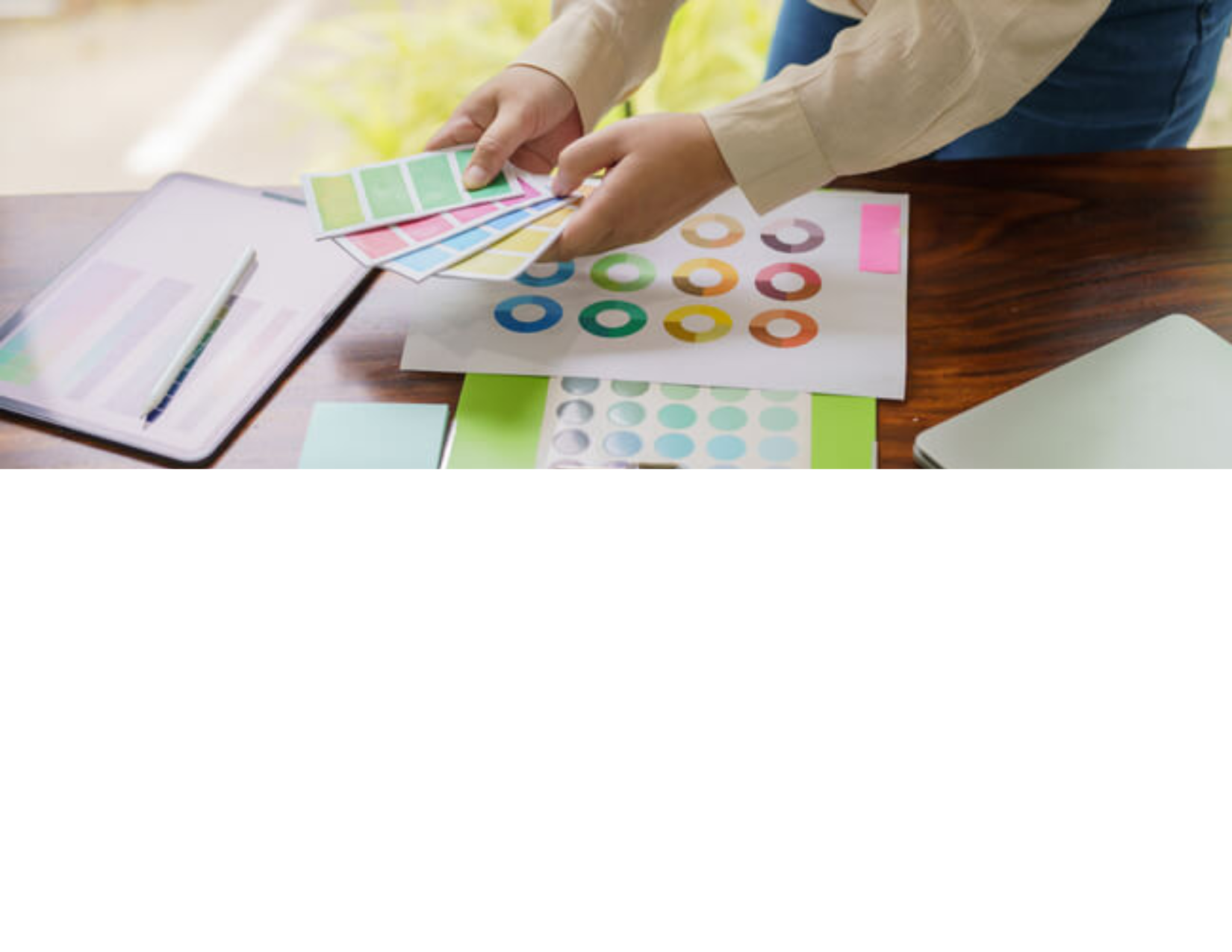
There have been many studies throughout the years about the power of color choice and the psychology behind it all. Stand out with your printed marketing and make a splash with thoughtful color choices that promote your business in its best light.
The Psychology of Colors
Choosing the right color for the emotion or mood you want to convey is essential to every business. Consider the following colors and moods or emotions they enhance and whether they would complement your business or detract from its core.
Red: Excitement, Passion, Anger
Did you know that hunger is enhanced at the sight of red?
Many popular restaurants capitalize on branding and decorating with red to encourage customers to eat more.
Blue: Calm, Peaceful, Trust
Banks often use the color blue in their logo to assure customers they are trustworthy and have a calming presence.
Green: Nature, Growth, Optimistic
Many technology companies use green to invoke feelings of optimistic growth and change.
This connection of green with growth parallels green pastures and fields in nature, how people typically connect green with the natural world’s growing plants.
Yellow: Happiness, Warmth, Caution
Yellow is often used to grab attention and evoke feelings of happiness and warmth. However, it can also serve as a warning or signal caution.
Brands may use yellow to stand out and create a cheerful and inviting atmosphere.
Purple: Luxury, Creativity, Wisdom
Purple is commonly associated with luxury, creativity, and wisdom. It has a rich history tied to royalty and sophistication.
Many high-end brands and creative industries use purple to signify elegance and originality.
Orange: Enthusiasm, Energy, Fun
Orange combines the energy of red and the happiness of yellow. It is often used to create a sense of enthusiasm and fun.
Sports teams and entertainment companies frequently use orange to convey a lively and energetic atmosphere.
Black: Sophistication, Power, Mystery
Black is a powerful color that conveys sophistication, elegance, and mystery. It is often used to create a sleek and modern look.
Luxury brands and high-end products use black to signify exclusivity and high quality.
White: Purity, Simplicity, Cleanliness
White represents purity, simplicity, and cleanliness. It is often used to create a minimalist and modern aesthetic.
Healthcare and technology companies often use white to convey a sense of cleanliness and efficiency.
Attract and retain attention with your customized print marketing designs and embrace the power of color! Connect with one of our experts to collaborate on color choices for your next print marketing design to best promote your business!
